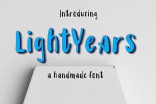
Lightyears
Lightyears is a display font—not a workhorse text face, but a deliberate, expressive voice. It’s designed to be seen, remembered, and felt: a hand-crafted yet confident presence with uneven baselines, subtle irregularities, and generous spacing that breathes without shouting. Its charm isn’t polished perfection—it’s authenticity, warmth, and quiet confidence. That makes Lightyears especially valuable for people who need their visual communication to land with clarity *and* character: marketers launching a campaign, educators designing learning materials, freelancers branding client projects, or small business owners refreshing their website hero section.
Where Lightyears Fits in the Creative Workflow
Fonts aren’t chosen in isolation—they’re selected as part of a sequence. Lightyears rarely appears in the first sketch or wireframe stage. Instead, it enters most naturally during the *refinement phase*: after messaging is locked, audience intent is clear, and the goal shifts from “what are we saying?” to “how do we make this unforgettable?” That timing matters. Using Lightyears too early—before tone, hierarchy, and purpose are defined—can distract from structural decisions. But deploying it at the right moment sharpens focus, reinforces personality, and signals intentionality.
For example, a blogger drafting a series on personal growth might finalize headlines and subheads in a neutral sans-serif during editing. Only once the emotional arc of each post is settled does Lightyears step in—for the title treatment on the published page. That delay ensures the font serves the message, not the other way around.
Before the Project: Preparation and Compatibility
Before importing Lightyears into your design tool, assess compatibility and context. It’s a variable font (with weight and width axes), so check whether your platform supports variable font rendering—Figma and modern versions of Adobe Creative Cloud do; older web environments may require static files. If you’re embedding it on a website, serve only the weights and styles you’ll actually use. Lightyears includes Light, Regular, Medium, Bold, and Condensed variants—don’t load all five if your layout only uses Regular and Bold.
Also consider pairing. Lightyears thrives alongside clean, highly legible text fonts—think Inter, Lato, or even system stacks like -apple-system, BlinkMacSystemFont. Its expressive nature needs contrast to avoid visual fatigue. Avoid pairing it with other decorative or high-contrast display faces. The goal isn’t harmony through similarity, but balance through distinction: Lightyears sets the tone; your body font delivers the substance.
During Execution: Practical Implementation Tips
Lightyears works best when given room. Its charm lives in its rhythm—not uniformity—so avoid tight tracking or excessive letter-spacing. Let the natural variation breathe. For headings, start at 48px and scale up. At smaller sizes (below 32px), details like the subtle curve on the lowercase “a” or the angled crossbar on the “e” begin to blur. Reserve it for large-scale impact: hero banners, chapter openers, presentation slides, packaging front panels, or social media cover images.
Use it intentionally—not ornamentally. One effective pattern: apply Lightyears to *only one typographic element per layout*. A newsletter header? Yes. A product card title? Yes. But don’t cascade it down to subheadings, captions, or buttons unless there’s a strong conceptual reason (e.g., a cohesive brand identity system where every touchpoint echoes the same expressive voice). Consistency here isn’t about repetition—it’s about restraint and recognition.
Color matters, too. Lightyears has moderate stroke contrast and open counters, so it performs well on light and dark backgrounds—but test. On deep navy or charcoal, avoid thin weights; they can disappear. Conversely, on white, the Light weight gains elegance and airiness. Always preview in real conditions: on mobile screens, in browser tabs, in printed mockups—not just in design software.
After Delivery: Long-Term Use and Quality Control
Once Lightyears is live—on a site, in a brand guideline, or embedded in a template—its role evolves from expressive accent to functional asset. That means documenting usage clearly. Include examples of appropriate scale, color contrast ratios (aim for at least 4.5:1 against background), and prohibited uses (e.g., “Do not use Lightyears for body copy, data tables, or legal disclaimers”). This isn’t bureaucracy—it’s efficiency. It prevents misapplication by teammates, contractors, or future-you returning to the project six months later.
Also audit periodically. Does Lightyears still reflect your current voice? Brands evolve. A startup using Lightyears for its playful, approachable launch phase may outgrow that tone as it scales—without needing to abandon the font entirely. Instead, shift how it’s used: from dominant headline to subtle watermark, from primary logo lockup to secondary campaign motif. Flexibility lies not in changing fonts constantly, but in adapting application with intention.
Integration Across Tools and Teams
Lightyears integrates cleanly across common workflows—but requires slight adjustments depending on environment. In Figma, install the variable font file and use the weight/width sliders for rapid iteration. In Webflow or WordPress, upload the WOFF2 files and define CSS variables for consistent reuse. For print production, export static OTFs for precise RIP handling—especially for spot-color jobs or foil stamping, where fine detail matters.
If you collaborate with developers, share a lightweight CSS snippet rather than assuming they’ll generate it:
- Define the font face:
@font-face { font-family: 'Lightyears'; src: url('lightyears-regular.woff2') format('woff2'); font-weight: 400; font-display: swap; } - Apply sparingly:
h1, .hero-title { font-family: 'Lightyears', sans-serif; font-weight: 400; } - Ensure fallbacks: Always include a generic sans-serif in the stack.
For non-designers—educators building Canva presentations, marketers using Mailchimp templates—download the desktop version and install it locally. Then use it in native apps where web font limitations don’t apply. No need to over-engineer access: simplicity enables adoption.
Real-World Use Cases, Not Hypotheticals
A freelance illustrator uses Lightyears in her portfolio’s “About” section—not for the bio text, but for the single word “Curiosity” set large above her statement. It signals mindset before content does.
A language-learning app applies Lightyears to milestone badges (“First Conversation”, “Week 5 Streak”)—not as decoration, but as psychological reinforcement. The font’s friendly irregularity mirrors the human, non-linear process of acquiring fluency.
A community garden co-op prints Lightyears on reusable tote bags for volunteer days. It’s legible at arm’s length, warm enough to invite participation, and distinct enough to stand out among generic event swag.
None of these rely on Lightyears doing heavy lifting. Each leverages its specific strengths—expressiveness, memorability, tonal clarity—at the exact point where attention needs direction.
Final Consideration: It’s a Tool, Not a Guarantee
Lightyears won’t fix weak messaging, unclear strategy, or inconsistent branding. What it *does* do is elevate execution—when applied with awareness of context, audience, and purpose. Its authenticity resonates because it doesn’t try to be everything. It’s narrow in scope and deep in character. That makes it unusually reliable for professionals who value precision over polish, clarity over clutter, and humanity over homogeneity.
If your workflow values intentionality—if you plan before you place, test before you ship, and refine before you release—Lightyears fits naturally. Not as an afterthought. Not as a trend. But as a considered choice, made at the right time, for the right reason.